
|
Alban Grosdidier is a French photographer and graphic designer, living between Copenhagen and Paris
This series is called drowning. It addresses the feeling of submersion that you have living in a big city, as the result of social or work issues. This picture also addresses relationships
|
|
David Ryle is a London based photographer, he achieves this technique by photographing models behind distorted windows. It creates the effect that the image has been edited.
|

|
|
David Bailey was born on 2nd January 1938 and is an English photographer, regarded by some as one of the nation's best
In 1960 he became a photographer for British Vogue, his fashion photography and celebrity portraiture (known for having dramatic lighting effects) transformed British fashion and celebrity photography. His work reflects aspects of the 1960s British cultural trend
|

|

|
Edward Henry Weston was a photographer born on 24th March 1886. He began photographing at the age of sixteen after he received a camera from his father. His first photographs were of his aunt’s farm. His first photograph was published using Camera and Darkroom in 1906.
|
|
Rankin is an English photographer who made his name in publishing, he founded the magazine Dazed & Confused with Jefferson Hack in 1992. He lives in London with his wife and son. Rankin became known for his portraiture of bands, artists, supermodels and politicians. He has even photographed the Queen of England and is often seen as a celebrity photographer. He has published over 30 books.
|

|

|
Clarisse D'Arcimoles was born in Paris in 1986, she now lives in London. This series is called 'Un-possible retour' meaning ‘a possible impossible return'. Each of these works consists of a photograph taken from her family album and a picture of the same person taken in a scene that has been replicated years later.
|
|
This series is called Things Come Apart and it is an expansion of Mclellan's original Disassembly Series. These images explore modern to retro items that have been or are in our everyday lives. A book of this series had been published by Thames & Hudson
|

|

|
She was born in 1967 and is a German photographer. She tends to photograph at night, and mostly explores urban landscapes to achieve her style of photography.
|
Depth of Field
It is the amount of distance between the nearest and farthest objects that appear in acceptably sharp focus in a photograph. A larger aperture means a smaller space for the light to pass though, this makes the image focus on a subject.
f/16
|

f/8
|
Rule of Thirds


|

|


|

|
Rule of Thirds homework
Extreme Perspective Homework

|
|

|
|
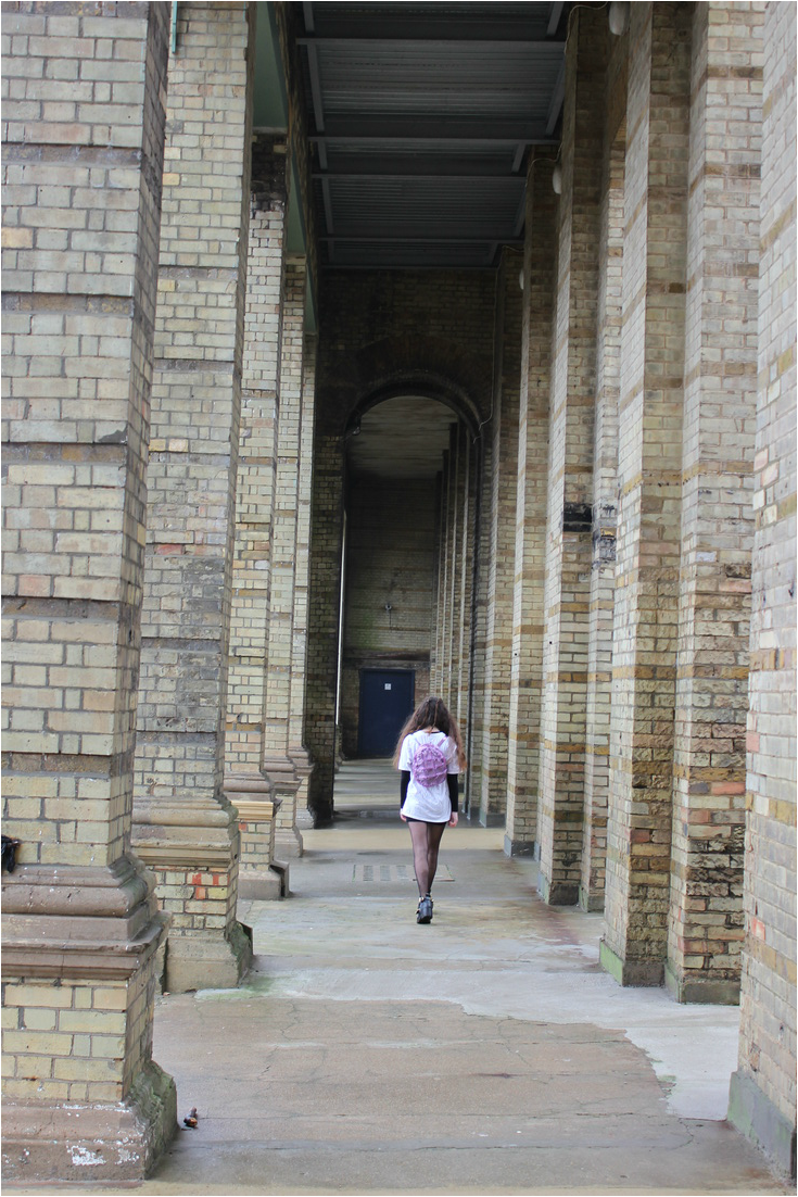
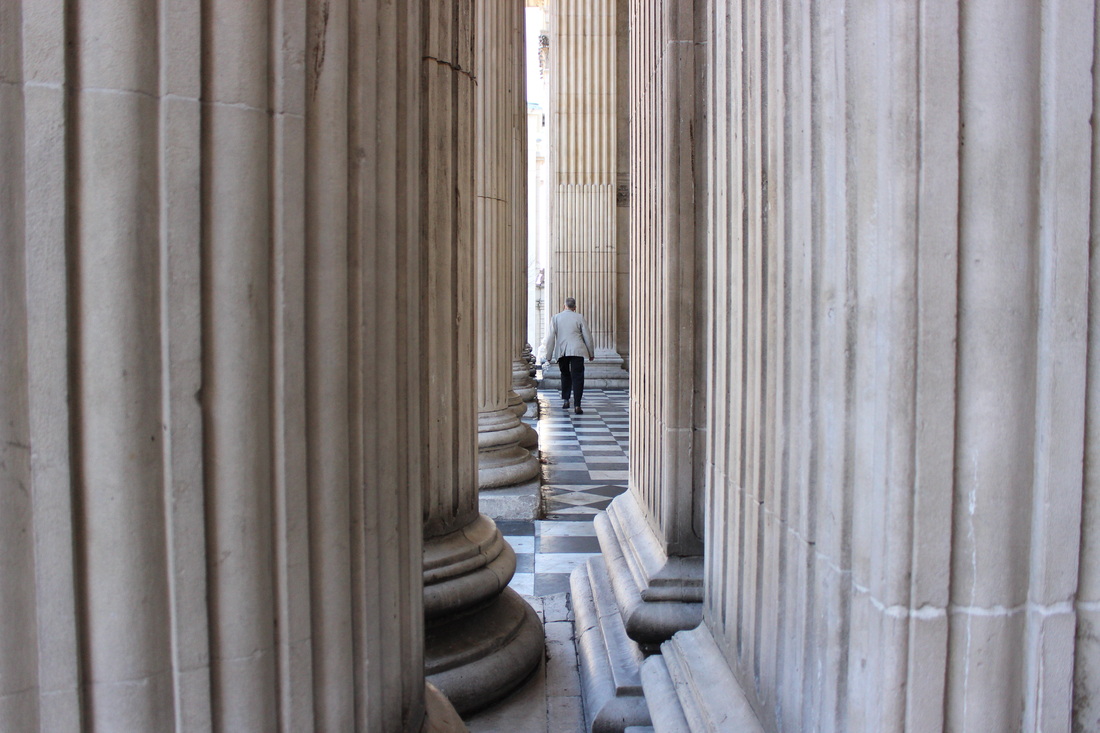
I took a lot of pictures facing upwards and through columns to achieve these results.
Photographers' Gallery Exhibition

On first impressions, the exhibition looked bare as there were only a few images in a large room. However, the vibrance of the colourful images filled the room. I hope to use this research in my own work by creating a powerful juxtaposition between ideas, in order to produce bold images.
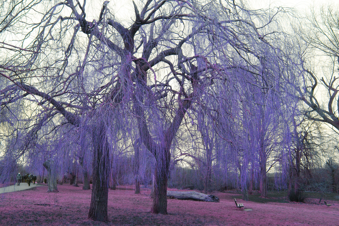
These images (are part of a series called Infra and) were shot in the Eastern Democratic Republic of Congo (DRC) during the Civil War. The images are a mixture of landscapes and environmental portraits of soldiers. Mosse documented sites of human rights violations in an attempt to overturn traditional realism and to see beneath the surface. He used an obsolete infra-red colour film to produce a false colour. The pink foliage indicates a healthy flora (there is a lot of this in the images), but it is juxtaposed with men with guns showing an environment filled with humans intent on killing each other. The contrast is made more extreme by the use of the infra-red film.
These images (are part of a series called Infra and) were shot in the Eastern Democratic Republic of Congo (DRC) during the Civil War. The images are a mixture of landscapes and environmental portraits of soldiers. Mosse documented sites of human rights violations in an attempt to overturn traditional realism and to see beneath the surface. He used an obsolete infra-red colour film to produce a false colour. The pink foliage indicates a healthy flora (there is a lot of this in the images), but it is juxtaposed with men with guns showing an environment filled with humans intent on killing each other. The contrast is made more extreme by the use of the infra-red film.

|

|
Personal Project
David Keochkerian is 35 years old and lives in France. He has been practicing photography for two years now. He often feels the need to create and to express himself. He likes to capture the rare and the spectacular and reveal the enthusiasm within the ordinary. He uses many photographic techniques (DRI, HDR, panoramic, vertorama, long exposure, ect), image renditions and different themes (landscape, macro, light-painting, architecture, industry). He is fascinated by sharp constrasts (light and colors) and creating dense outcomes.

|

|

|
Im interested in the vibrance and contrasts of the images and I chose to recreate his photography because I have never attempted to photograph nature specifically and I would like to see if I will be successful in editing the images once I've taken them.
First Response
|
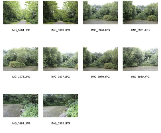
I took some images of a dull pond. Although they do not look very similar to Keochkerian's photographs, they will be edited in order to attempt to re create his style of photography (infra red editing).
|
1st Edit

This was oversaturated and the blending where the two colours meet isn't gradual.
2nd Edit

|
These are the multiple layers I used to edit this image in photoshop. Although the picture now looks more like a Keochkerian response, the colours are now a too dull and unsaturated.
|

|
3rd Edit

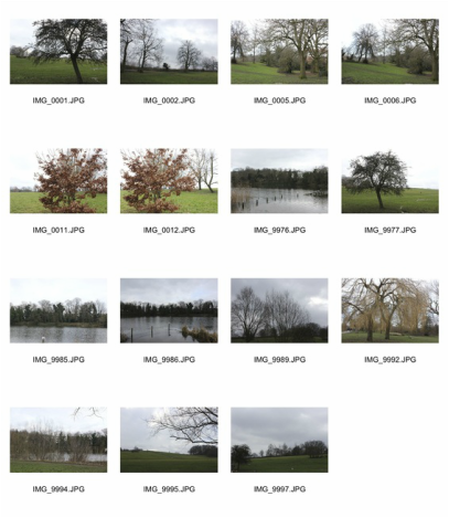
More Nature Observations
|
|
|
These were unfortunately taken on a cloudy day in winter, so the contrast is low and there is a lack of colour. However, after editing them infrared in photoshop the composition was improved
2nd Set of Edits
The colour in this looks very similar to Mosse's photographs and it is subtle enough to look like it could be real whist also being surreal. However the sky in the background is overexposed and the overall contrast is too low.
I have tried to correct this below 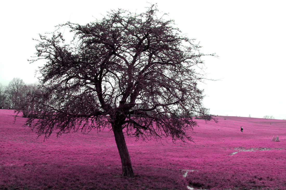
|
|
In this edit I experimented with different colours by changing the hue, channel mixers and photo filters

|
Process
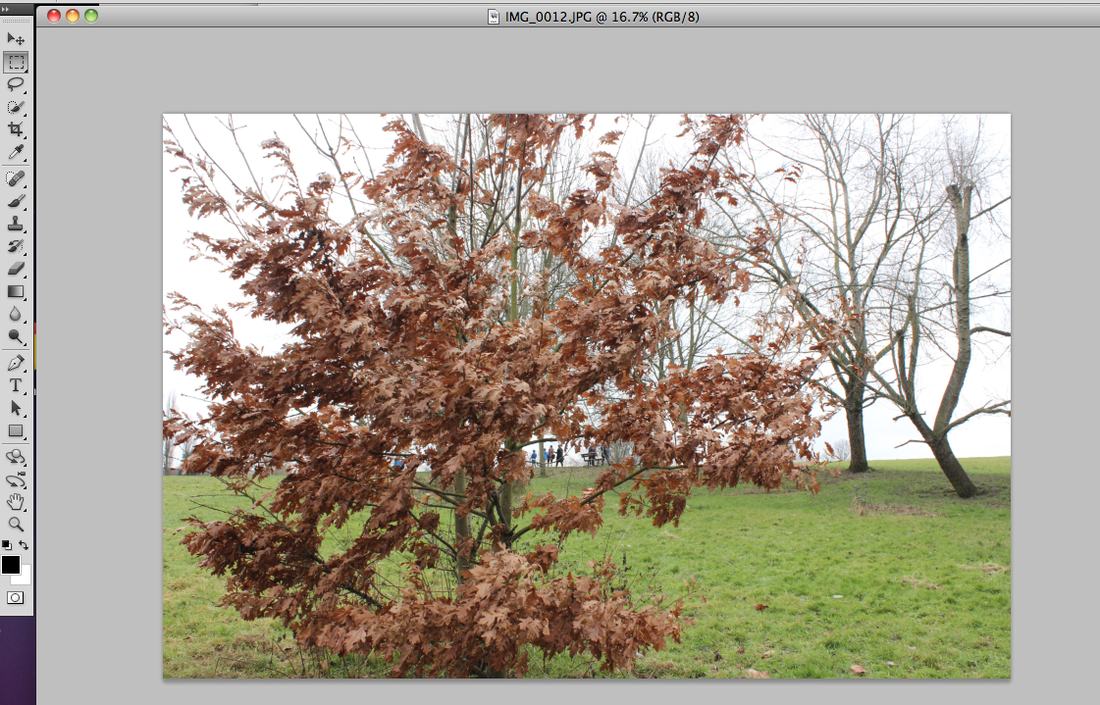
Open your original image
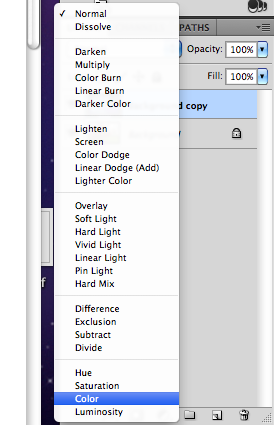
Change blending mode to colour
(grass purple - hot pink stage)
|
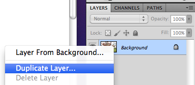
Create a duplicate layer of the background by right clicking on the background layer.
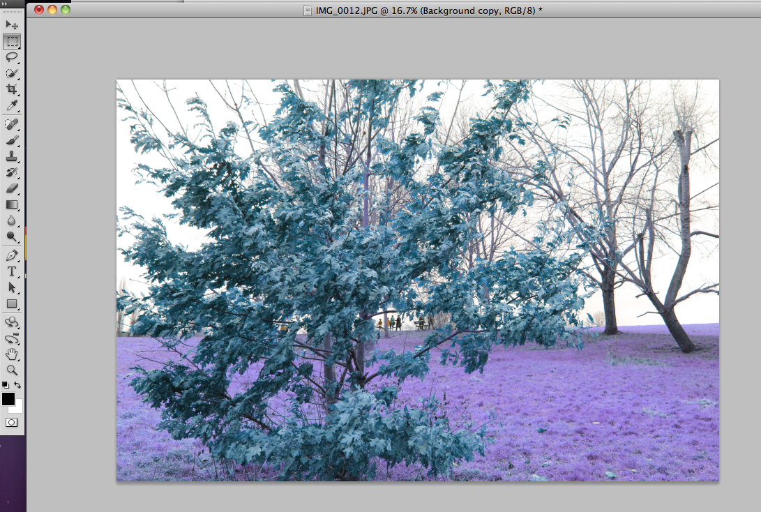
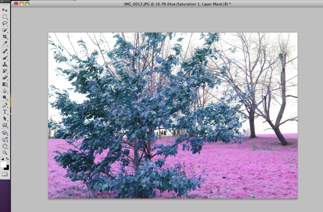
The image will then look like this
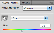
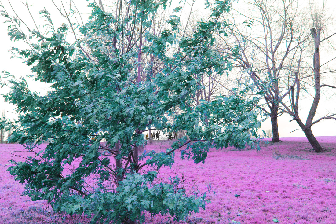
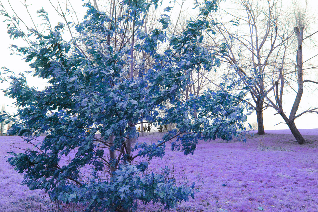
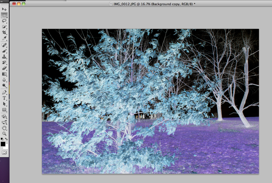
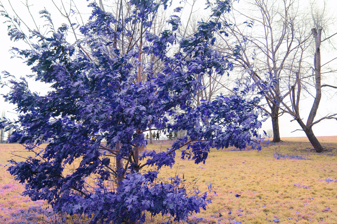
By changing the hue from 0 to -21 the tree will become more turquoise.
|
Press cmd + i to invert the colours
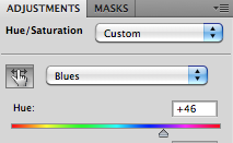
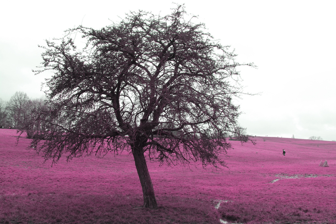
By changing the hue of 'blues' from 0 to +46, the grass changes from purple to hot pink

I also slightly improved the contrast for the final image, and by changing to different hues the colour will change accordingly so you can have any colours eg. the pictures above
|
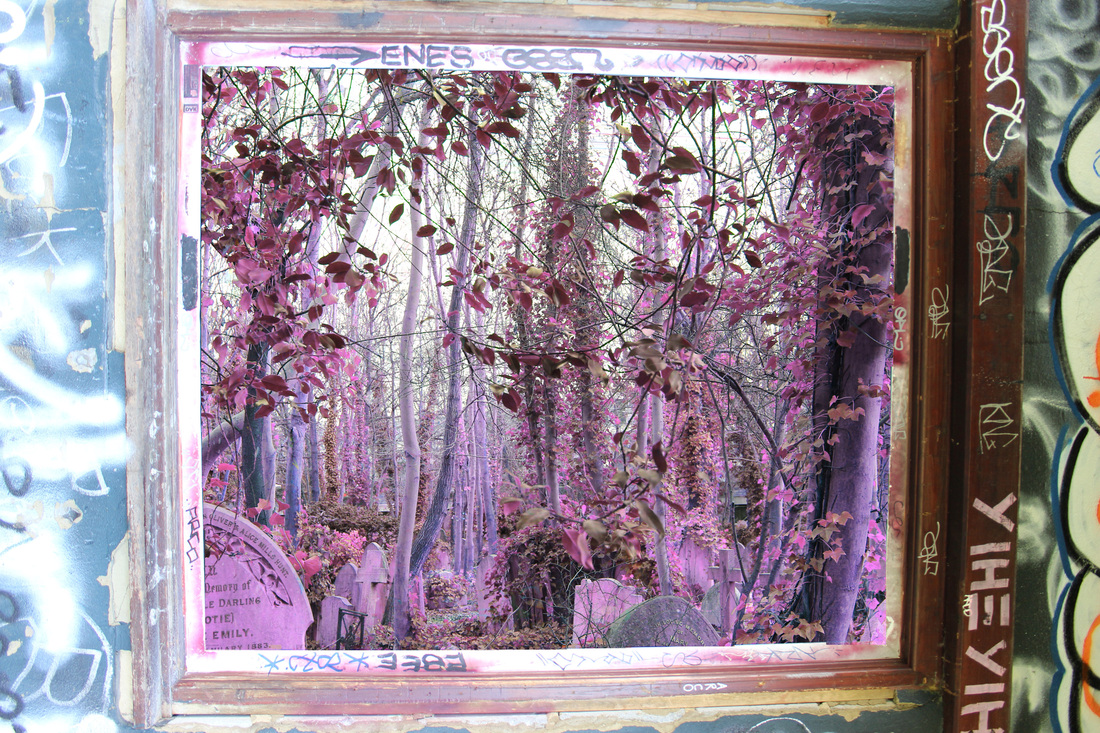
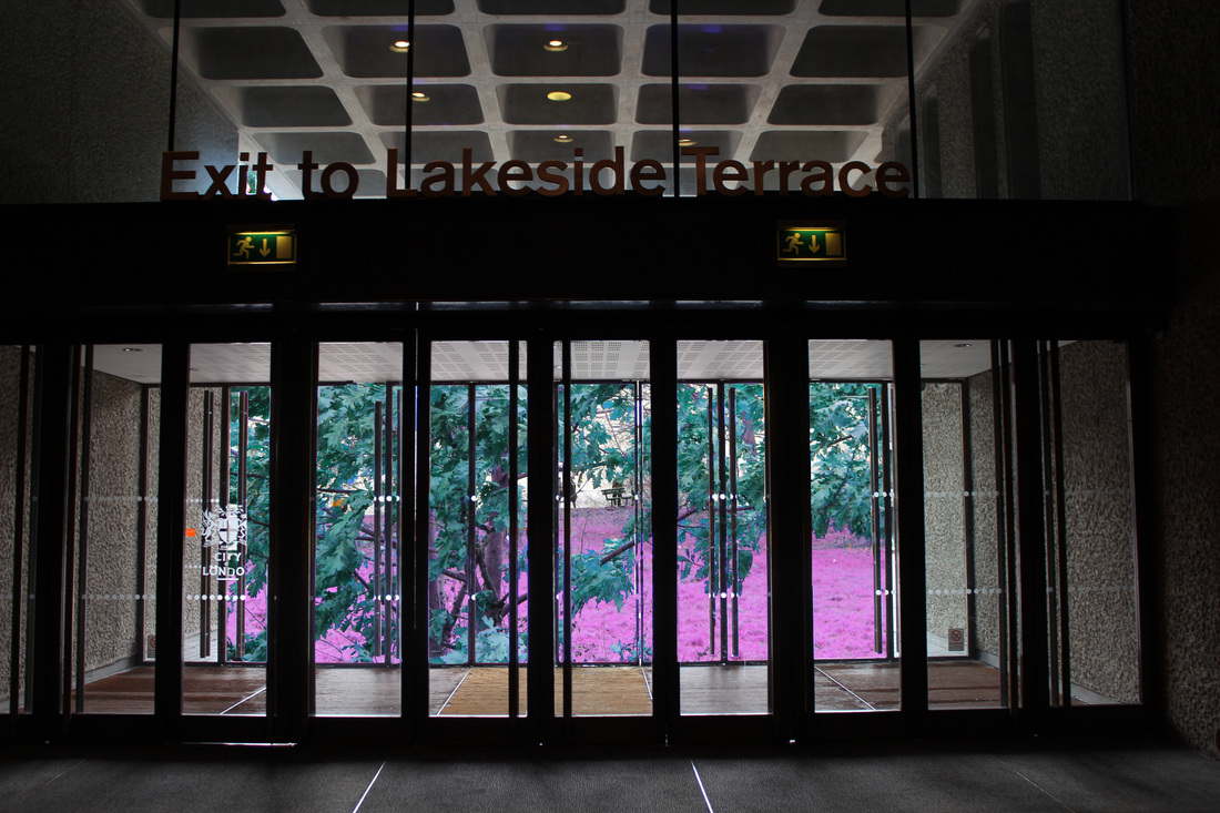
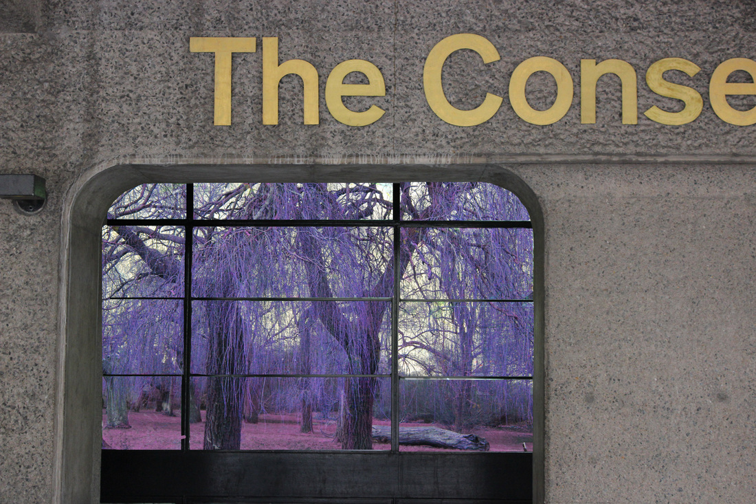
Man made vs Natural
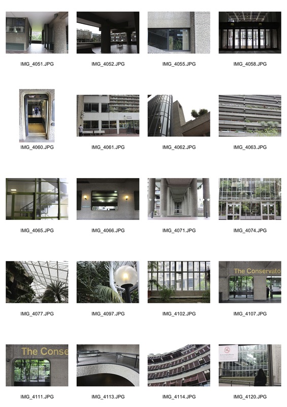
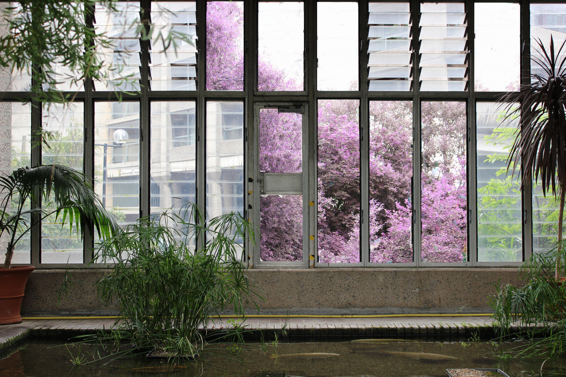
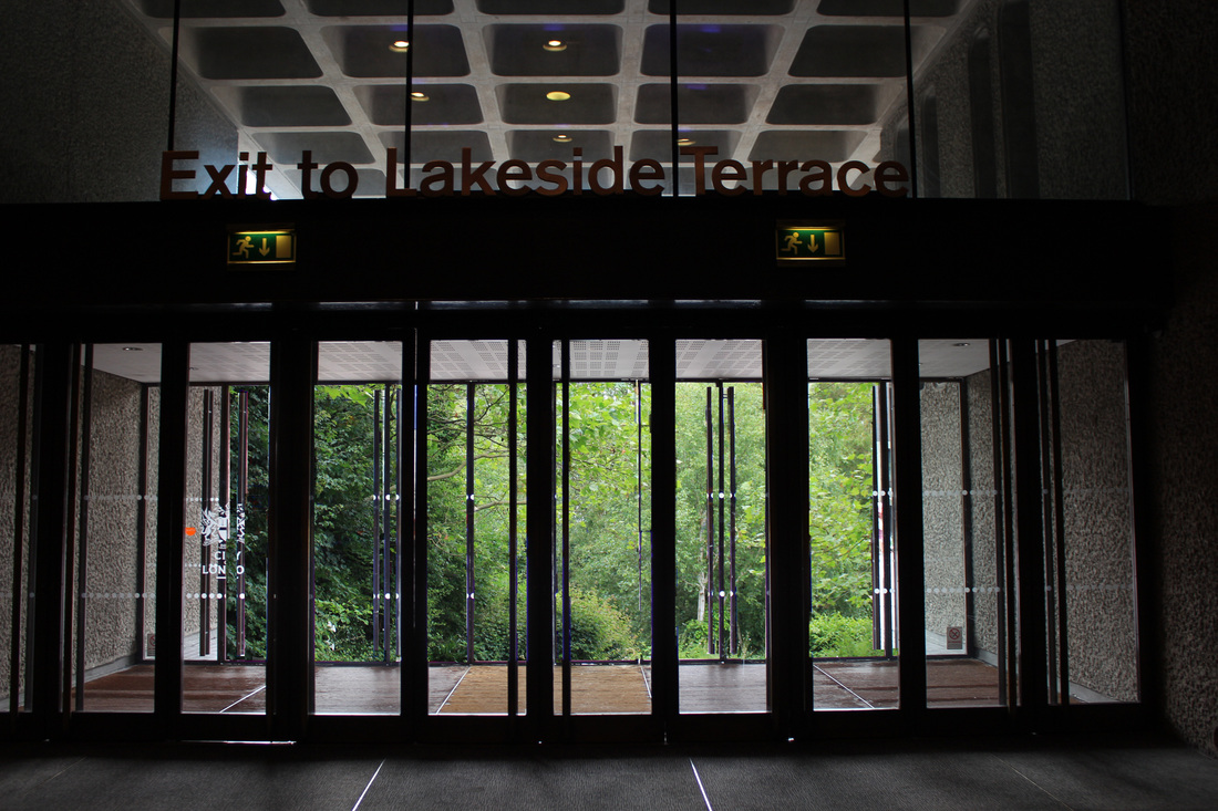
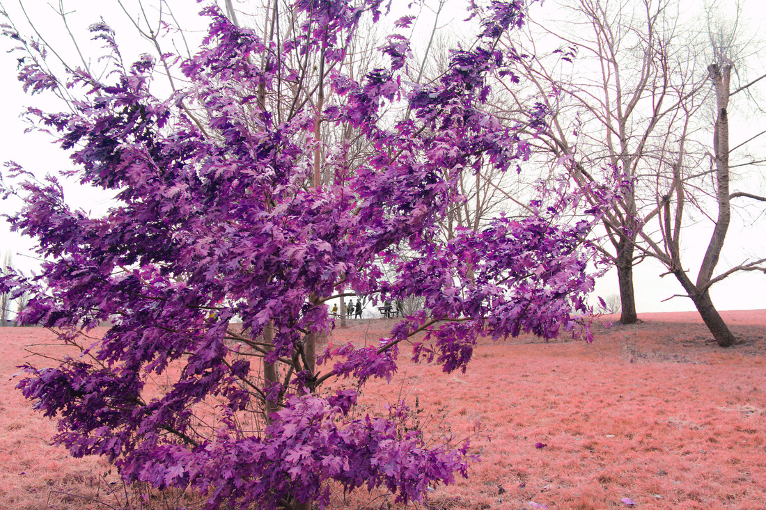
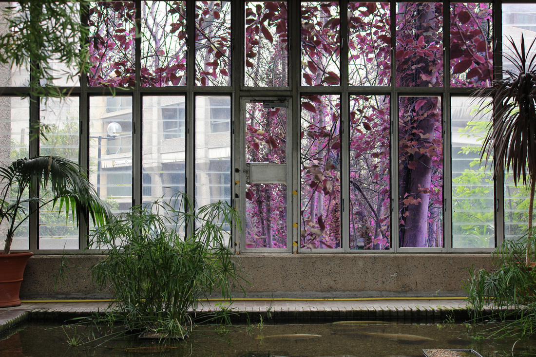
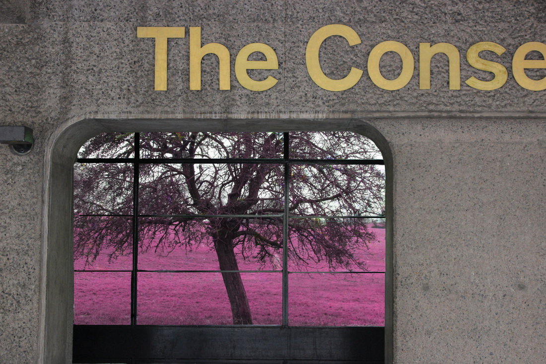
I decided to make my main theme to man made vs natural so that it was a more solid idea. I photographed the exterior of the barbican as it is primarily concrete and all typically man made, however the conservatory which I also photographed is a mix of both man made and natural which perfectly depicts my theme. I then layered these images over my nature edits in photoshop to create a contrast between the two. The natural edits retained their pink colour in order to add surrealism and stay similar to Keochkerian and Mosse's photographs.
First attempts
I only edited some of these sections in order to create a stronger contrast. It definitely made it more surreal however I'm undecided as to whether or not it improves the image
|

This was edited green to make it look more realistic and still maintain the contrast between nature and man made structures. However, this doesn't fully reflect the photographer's work
|
Second attempts
In this set of edits I used some of the same man made foregrounds but a wide range of natural backgrounds of all different colours to create more variety.
|
|
|
FINAL IMAGES
From all my observations and edits, I chose 6 images for my display:


|
|
The 3 different coloured trees are for display and the main images will be the merges of the man made and natural worlds. They will be larger and more elevated on thicker foam board on my display.
