|
together
təˈɡɛðə/ adverb
|
Simply the definitions for both together and apart inspire different ideas and outline alternate approaches I could take to this task
|
apart
əˈpɑːt/ adverb
|
Mind Map:
My initial thoughts, ideas and photographers relating to the theme of 'Together and/or Apart'
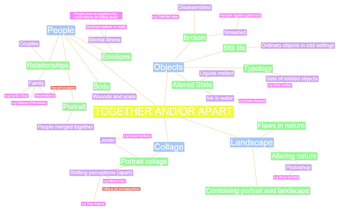
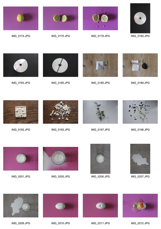
TASK 1: Objects
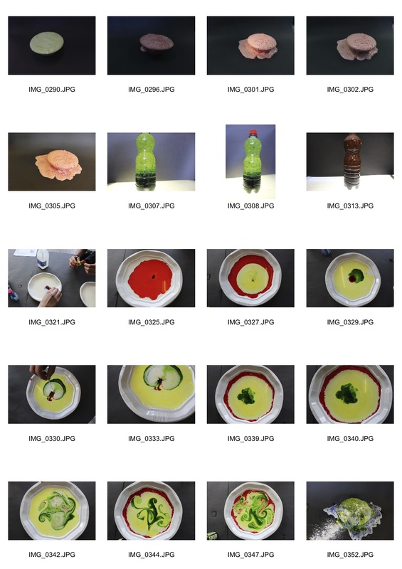
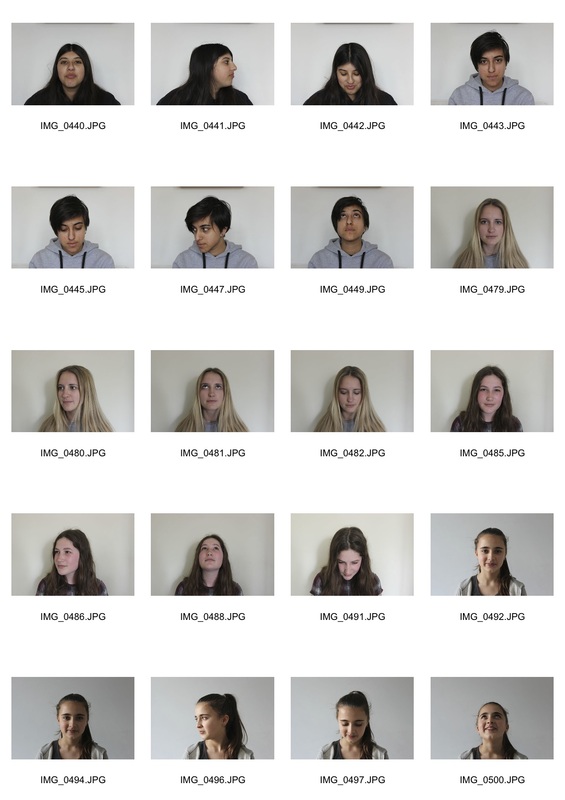
Contact sheets of my experiments:
|
|
Below are a few of my favourite images that I took as part of Tasks 1 and 2. I used mostly food products because they're versatile and easily available. I chose to photograph against a number of different backgrounds in an attempt to create vibrant and unconventional images and I feel that my 'favourites' represent this idea the most.
TASK 2: PORTRAIT
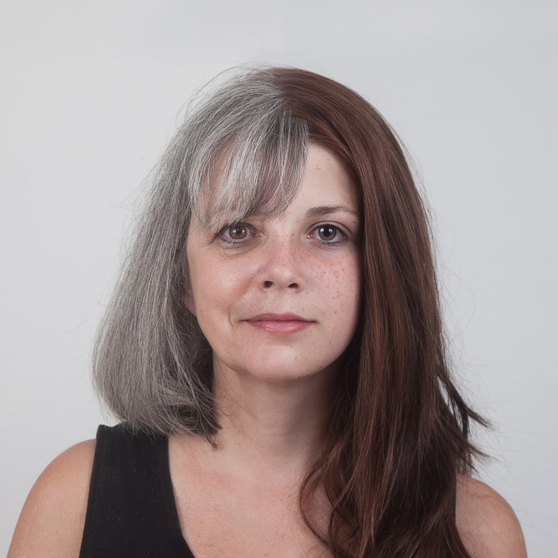
Photographer- Ulric Collette
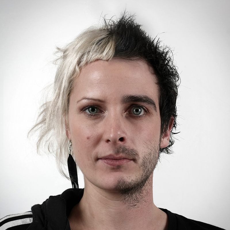
In this series called 'Genetic Portraits' Colette researches the genetic similarities between family members of different ages/genders. These portraits are interesting because they also explore the process of ageing. The way in which the two faces are merged seems effortless and natural, this combined with the fact that each pair is related goes with the theme of 'together' while the obvious different people, age gap and gender difference are more suited to the theme of 'apart'.
Grandmother/Granddaughter Aged 61 and 12
|
Cousins, Both Aged 29
|
MY RESPONSE
In our first attempt at responding to these images we photographed people in front of the same background and merged them in photoshop. Although they aren't related, these images capture the difference between people of the same age with different genders and genes. This response could be improved by editing the clothes so the change is more subtle.

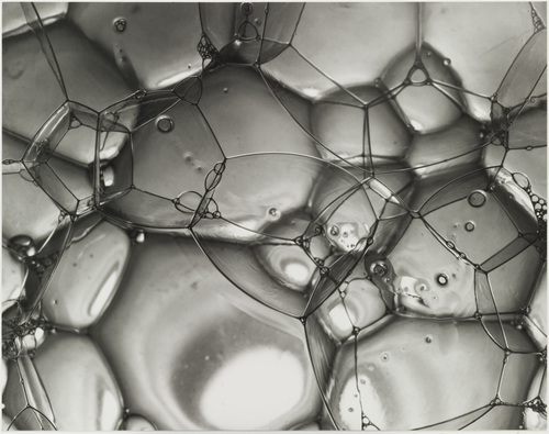
TASK 3: CHEMICAL REACTIONS
Photographer: Berenice Abbott
She was an American Photographer (born in 1898) mostly known for her black and white photographs. Abbott first became involved in photography in 1923 and later said "I took to photography like a duck to water", she began exhibiting photographs in 1926 and was inspired by Eugene Atgets photographs.

|
|
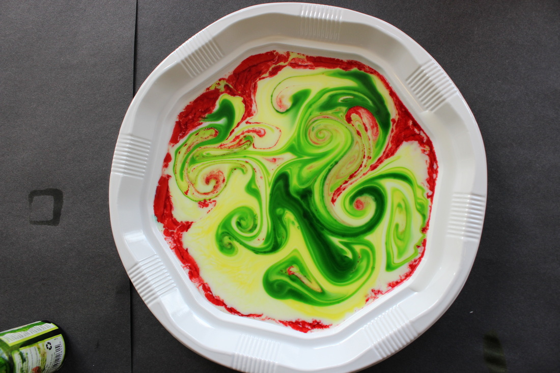
Response
In this task we used chemical reactions to represent Together and Apart. In performing these reactions we saw the result of putting substances that has previously been 'apart', 'together'.
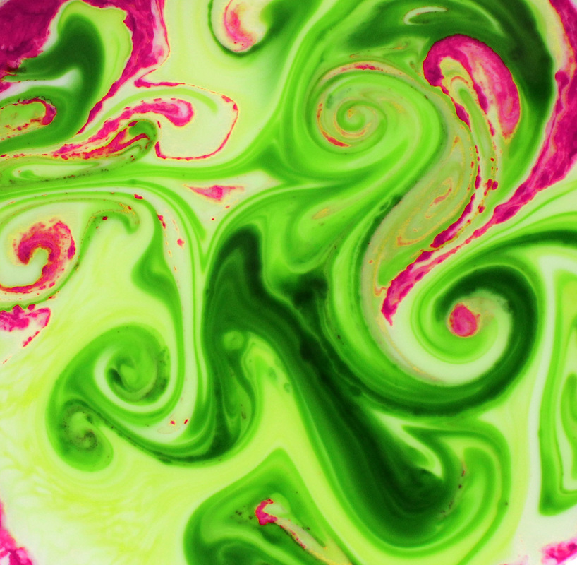
1. First, we put milk on plates with drops of ink and as we placed a cotton bud with soap on it in the middle the ink spread out and created many different patterns as the different coloured ink mixed 'together'.
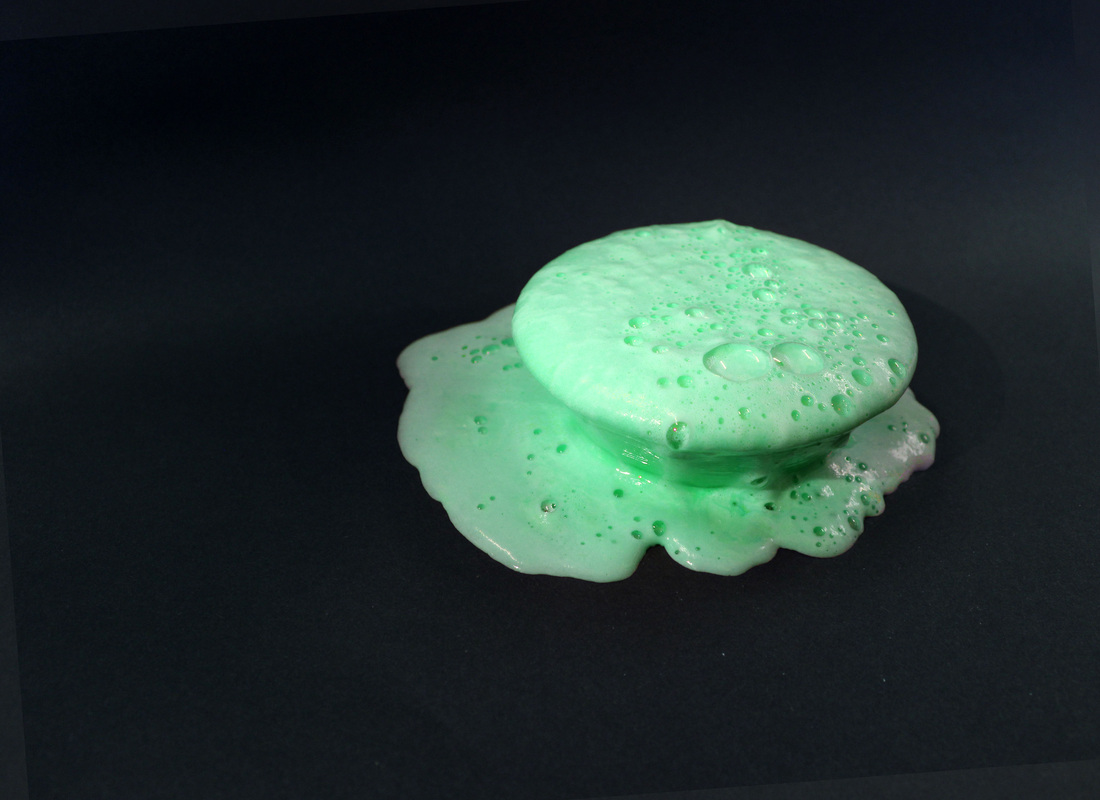
2. Next, we filled a bottle 3/4 full with oil and the rest with water. We added 10 drops of food colouring and Alka-Seltzer tablets which created a mini 'lava lamp' with bubbles floating 'apart'
3. We also mixed baking powder
1. First, we put milk on plates with drops of ink and as we placed a cotton bud with soap on it in the middle the ink spread out and created many different patterns as the different coloured ink mixed 'together'.
2. Next, we filled a bottle 3/4 full with oil and the rest with water. We added 10 drops of food colouring and Alka-Seltzer tablets which created a mini 'lava lamp' with bubbles floating 'apart'
3. We also mixed baking powder
BEST OBSERVATIONS
|

|


I edited the contrast of both images and altered the colours' saturation to create a sense of surrealism and a more powerful contrast. In the first image I used complimentary colours in order to make them seem more vibrant as when they're put 'together' they work well.
1) 'Time' by John Clang

This is a series that involves recording a location, to show the passing of time in a montage style. It depicts the intimacy of time and how people, although in a different time are travelling in the same space and therefore closer to one another.
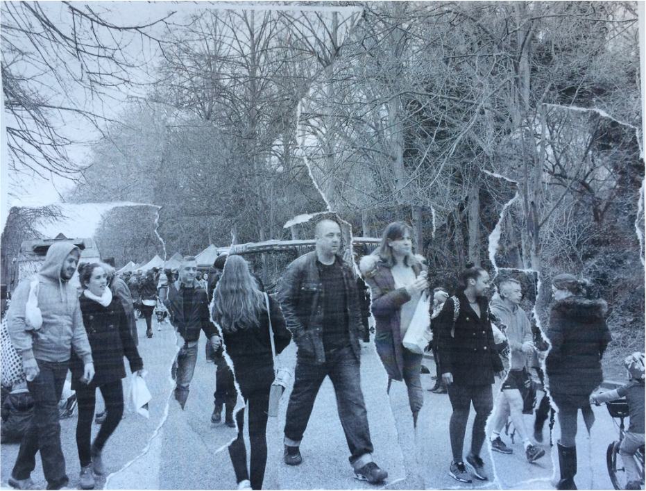
WWW: I like the way everyone seems connected in a such a small space and the way aspects of the background are lined up. However, it would be
EBI: If I got rid of the large rips which slightly separate the people and cut off body parts because these take over the initial attempt to depict the people 'together'
EBI: If I got rid of the large rips which slightly separate the people and cut off body parts because these take over the initial attempt to depict the people 'together'
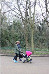
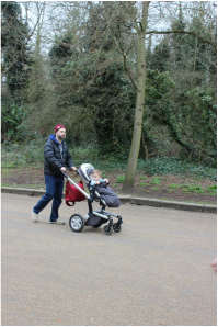
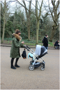
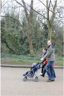
2) 'People of the 21st Century' Hans Eijkelboom

Typology and Street photography. These images show the often subconscious conformity of society.
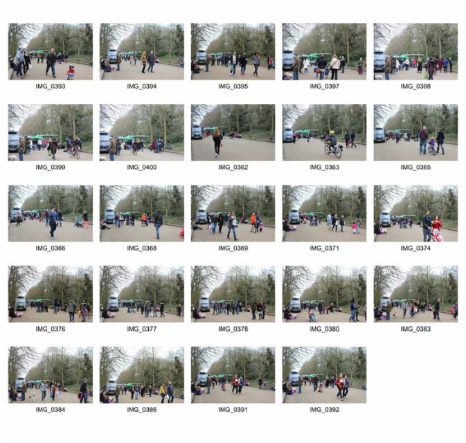
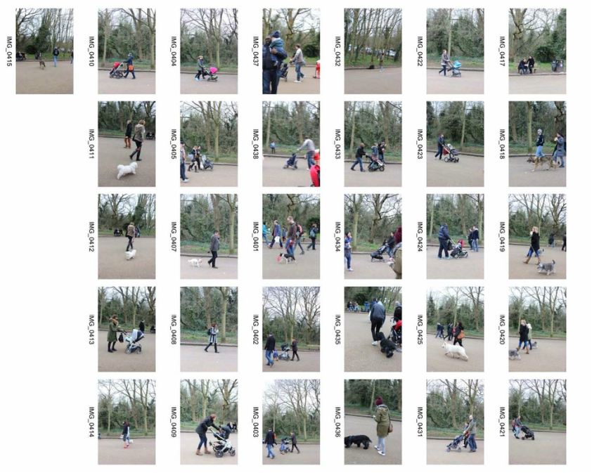
I decided to photograph people with the same possessions rather than a similar look. I took pictures of people/couples with buggies and dogs. I chose a suitable location (a farmers market) which meant that I could get lots of observations without having to wait for hours. Some images are blurry because the shutter speed was too slow and it was often difficult to photograph people without obstruction. But I do like the way all of the people look similar although they may not intend to which brings them 'together' in a sense.
Dogs
|
|
|
|
Buggies
|
|
|
|
CONTACT SHEET
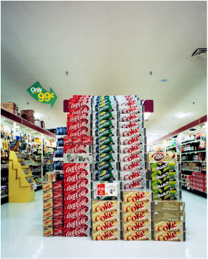
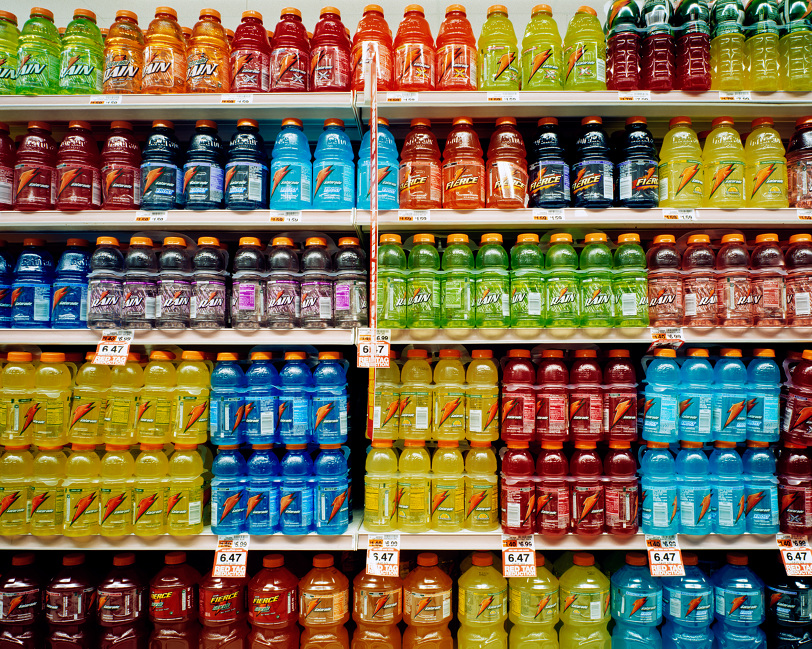
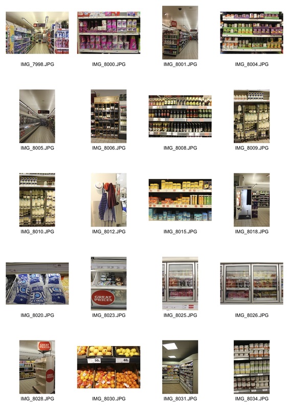
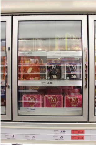
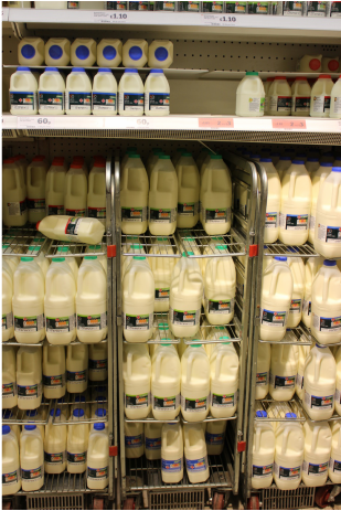
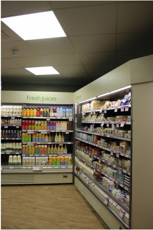
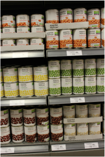
3) 'Consumerism' by Keith Yahrling
|
|
He is a professional photographer, based in Philadelphia who has been publishing his work since 2007.
Yahrling's intention is to change the way people behave as consumers, he says:
"I want people to think about the purchases they make and where they are making them. They should be thinking about how the product effects them personally, our environment, and other people. Even what the company itself stands for, because if a company is abusing it’s employees and you make a purchase at that store then you have had a hand in the workers mistreatment and if we want to make a real change we have the power to."
- In his images, rather than displaying the consumer, he's concerned with the physical space of the store which has one purpose: to convince a shopper to make a purchase, with this in mind he takes all his pictures with an devoid of people.
- I think the vertical format of many of his images works well in the shops because it gives the viewer a sense of how large some of these spaces actually are while the horizontal images work for using a wide horizontal frame to show a repeating pattern (in images like the gatorade bottles)
CONTACT SHEET
BEST PICTURES
|
|
|
|
I think these pictures turned out well especially with the lack of people and 'human life'. My favourites are the repeating patterns of similar products like tins or bottles. These images could have been improved by better framing them and altering the contrast on some of them. However, I think the images with signs like 'great value' really demonstrate the direct and clear intention of supermarkets which have a drastic effect on the economy and people's daily lives.
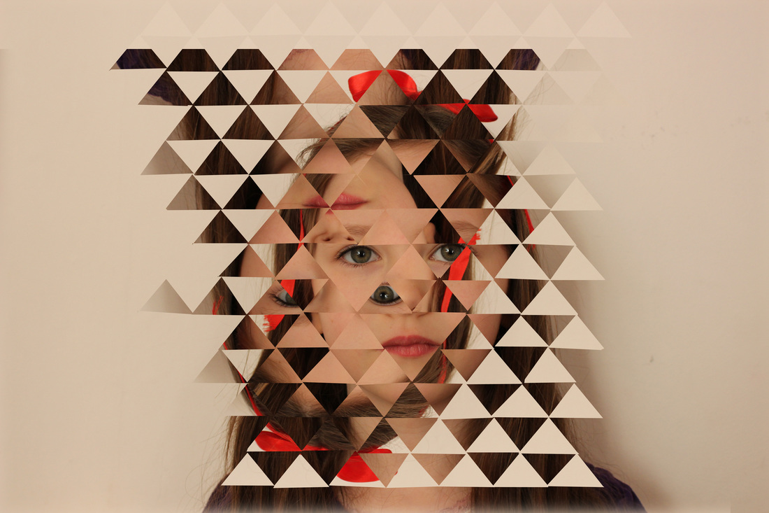
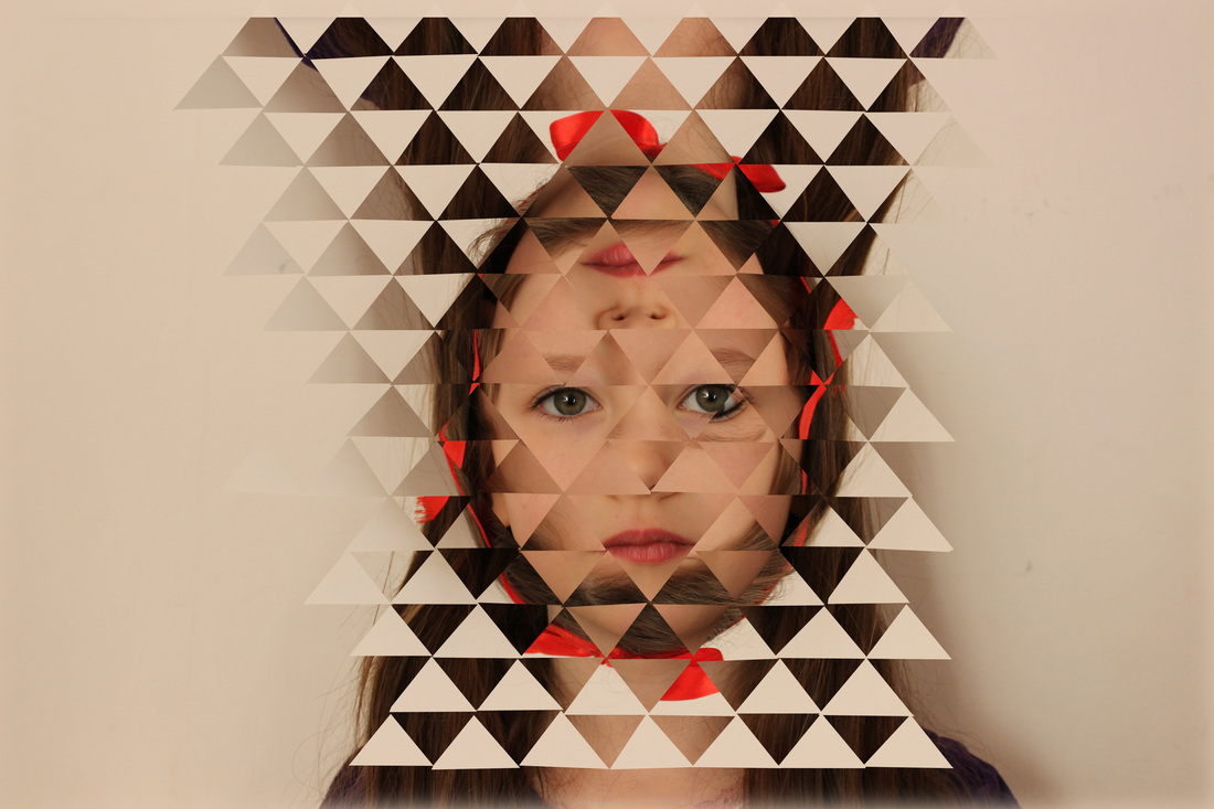
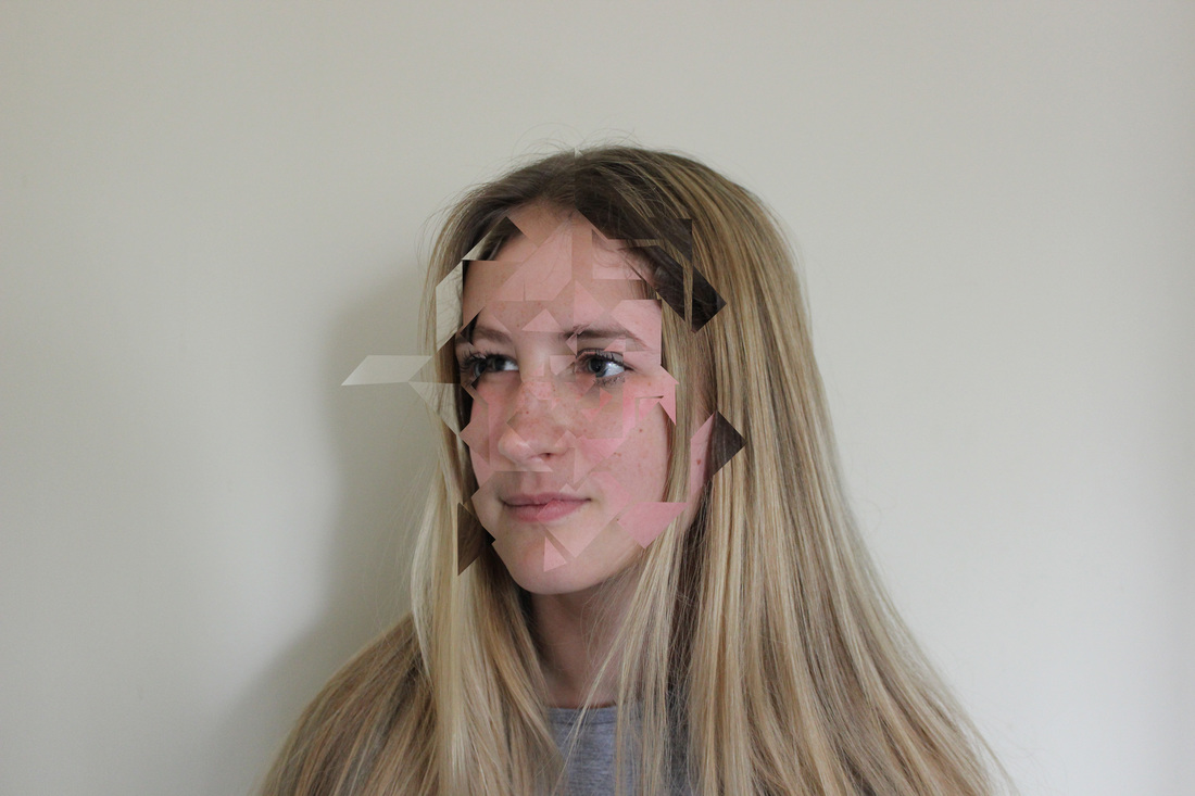
4) 'Haunted Mirrors' by Allison Diaz

Diaz's work focuses on ideas of shifting perspectives, identity and perception of reality.
She is a San Francisco-based collage artist. The inspiration behind her series of photographic work entitled 'Haunted Mirrors' came after she heard a story about a couple who broke up because of the man's Prosopagnosia (face blindness), a disorder that made it impossible for him to recognise other people's including his girlfriend's face. From this she decided that she "wanted to play with the brain's perception of faces".
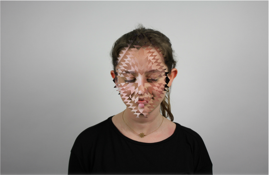
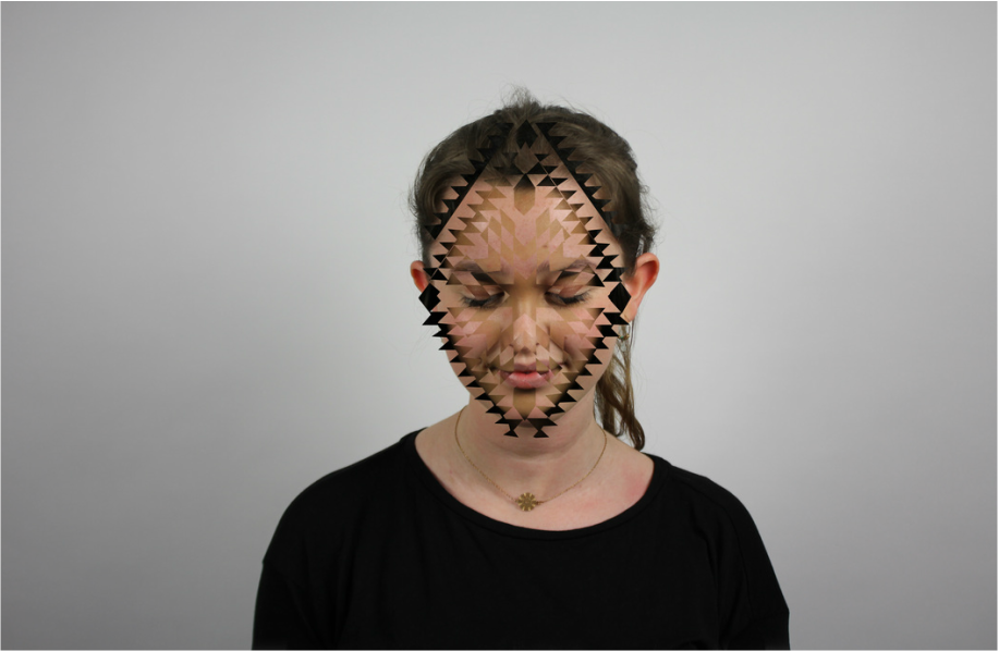
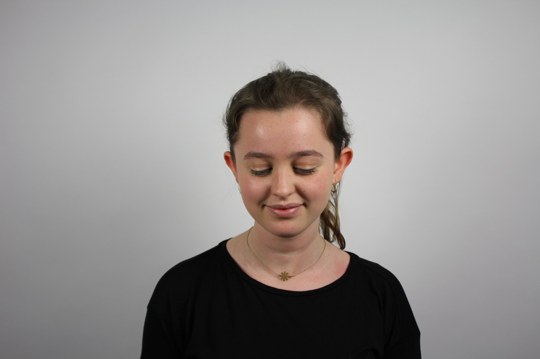
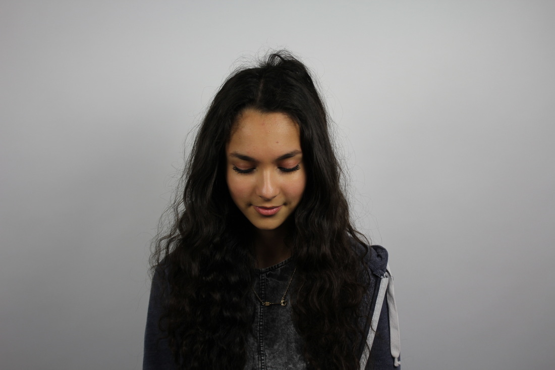
Original Images (and the isometric grid I used)
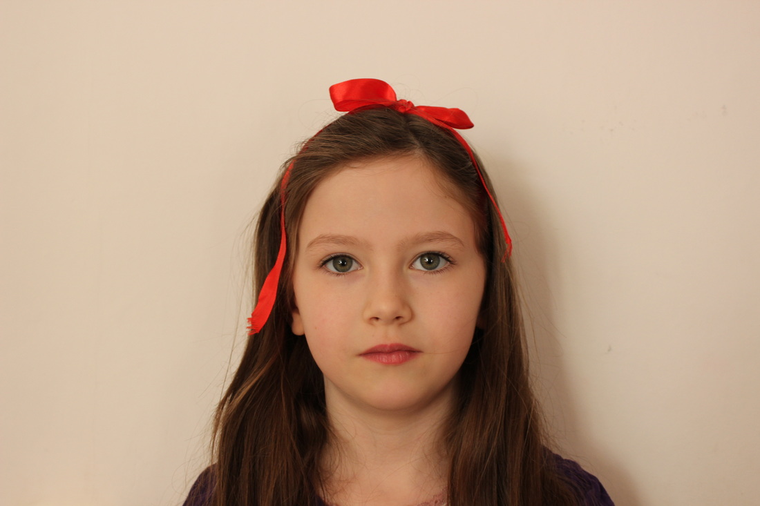
|

|

|
Process
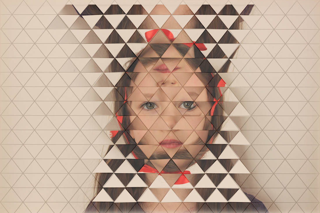
|
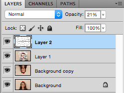

I layered a translucent (20 percent opacity) grid over my two images (one of which I rotated 180 degrees), I then chose the Polygonal Lasso Tool, selected alternate triangles and deleted them (on Layer 1) to reveal parts of the image (Background copy) below.
|
Edits
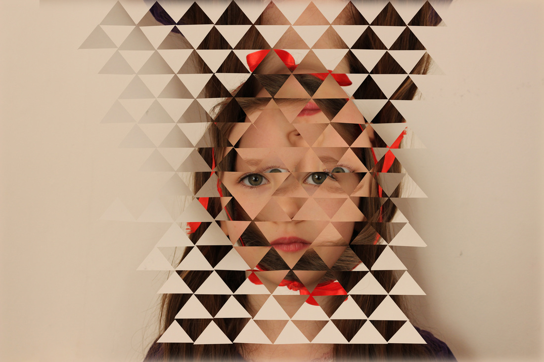
I changed the location of the pictures in each different edit to further alter the face. I think this worked well because prominent features can still be seen while the face is fragmented and 'apart'. It could be improved by using more than one person or editing the entire background rather than just the face. I especially like the third image because the eyes from the different pictures line up.
|
|

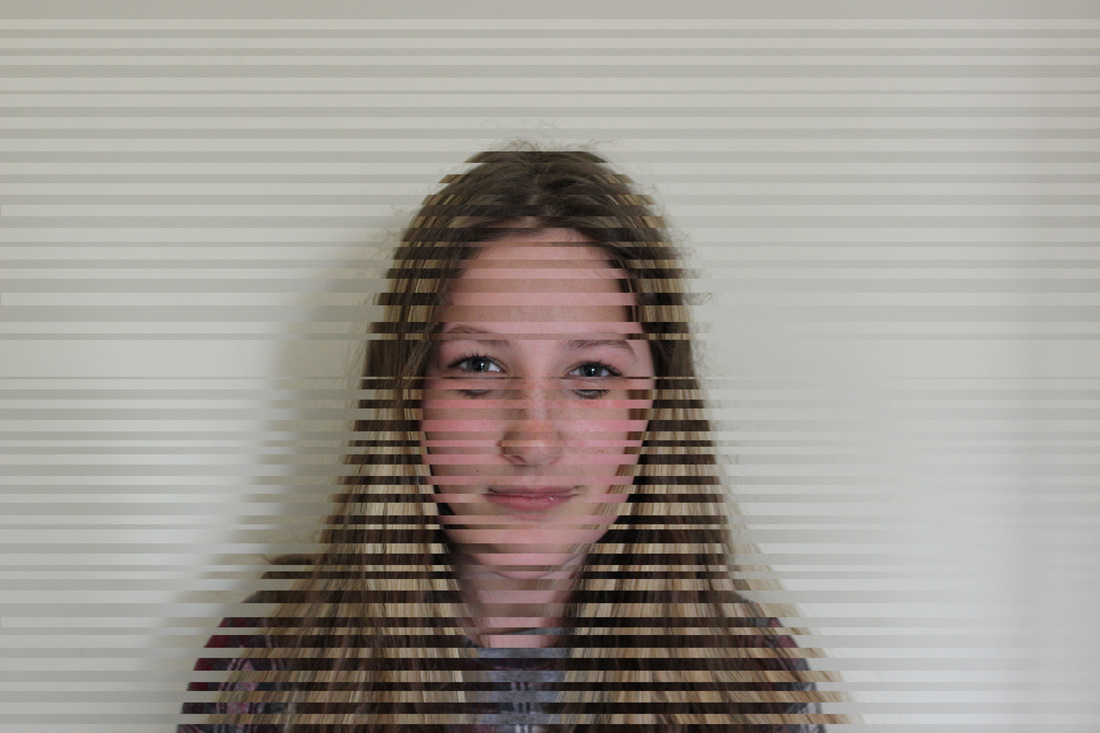
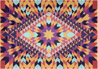
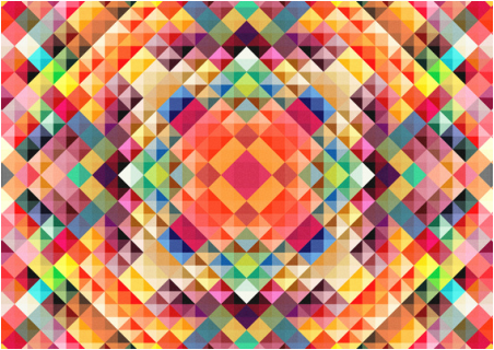
Riley (born in London, 1931) is an English painter who is a prominent exponent of op art - a style of abstract visual art that uses optical illusions which, when viewed, give off an impression of movement. Her first solo exhibition was held at Gallery One in 1962 and in the early 1960s she began to work with the contrast of black and white, sometimes using tonal scales of grey. These works were said to induce sensation in viewers from feeling seasick to sky diving. Riley introduced colour into her works in 1967 when she produced her first stripe painting. After taking a trip to Egypt, she was inspired by colourful hieroglyphic decoration and began to explore colours with contrast.

|

|

|
Contact Sheet
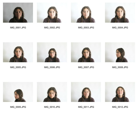
I took these pictures in the studio using professional lighting to minimise the shadows and altered the aperture and shutter speed from each picture to the next in order to perfect the contrast to the best of my ability before editing them.
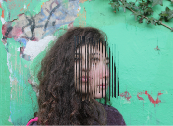
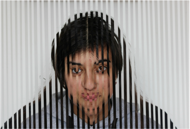
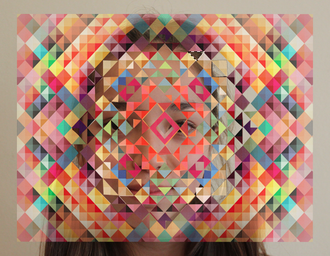
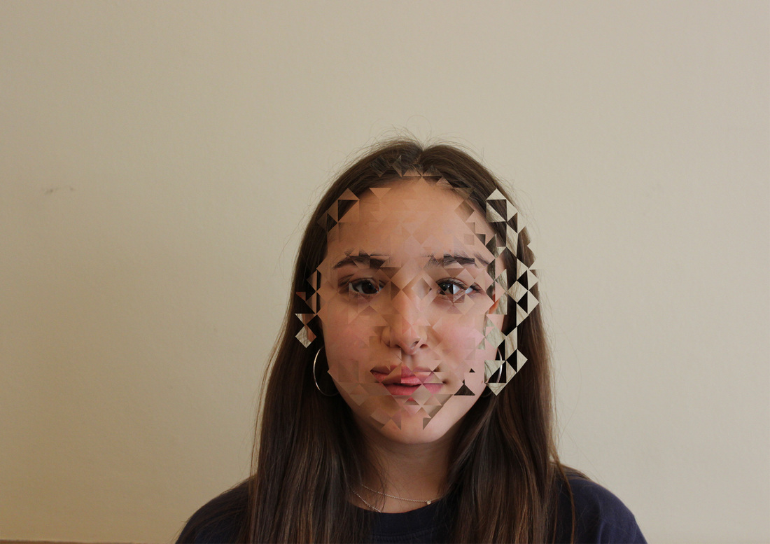
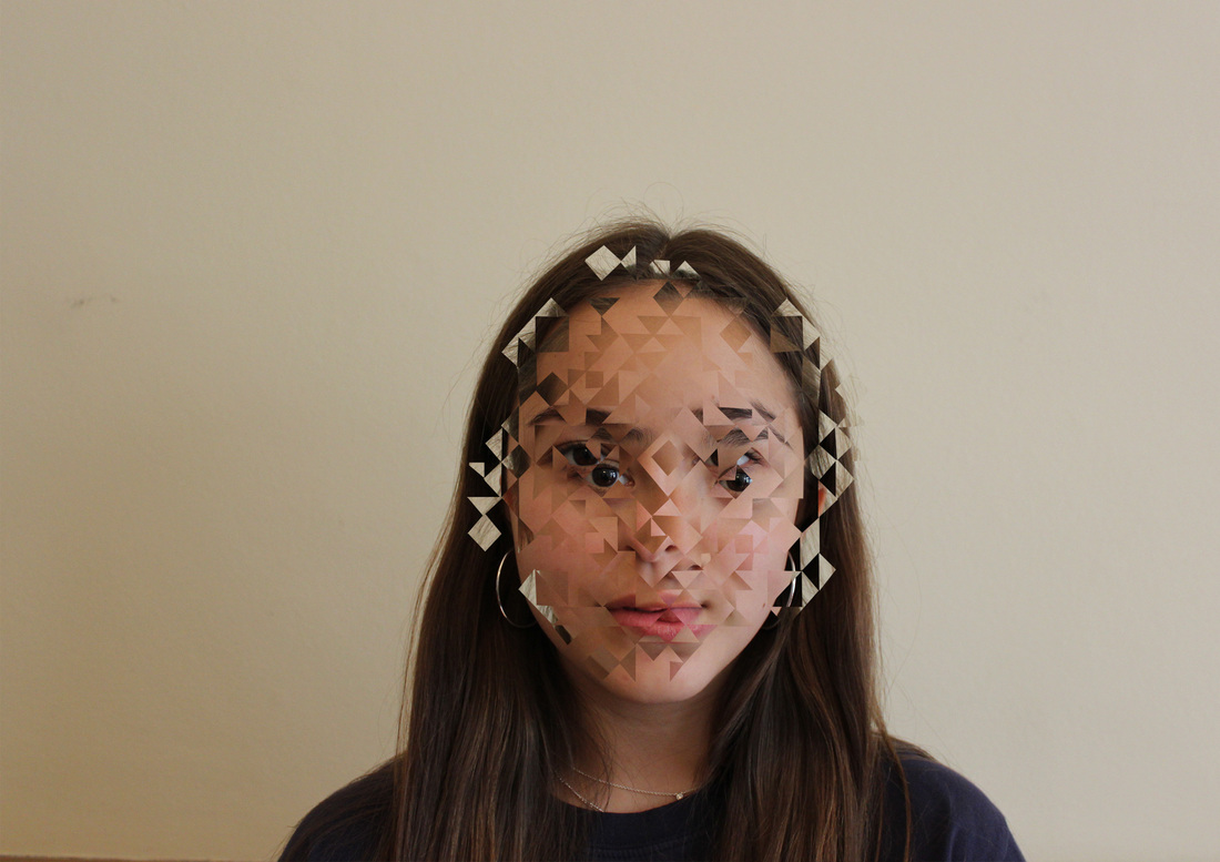
DEVELOPMENT 1: Rather than using a plain geometric grid, I used the patterns in Riley's paintings as a template and a white background to reveal a fragmented portrait underneath which contributes to the idea of 'apart', I will also made the white background slightly translucent which will display the 'together'ness of the whole photograph while it's being broken 'apart' by another layer.
Development 1
Development 2
DEVELOPMENT 2: I developed the idea further by using 2 different people's portraits, either friends, different ages or gender, putting them 'together' reflects one side of the task while they're still 'apart' and scattered because of the patterns.
SOME OBSERVATIONS
|
|
EDITS
|

The grid I used
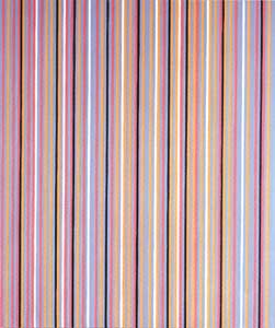
Bridget Riley's 'Saraband' 1985
|
Development 3
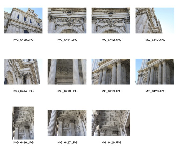
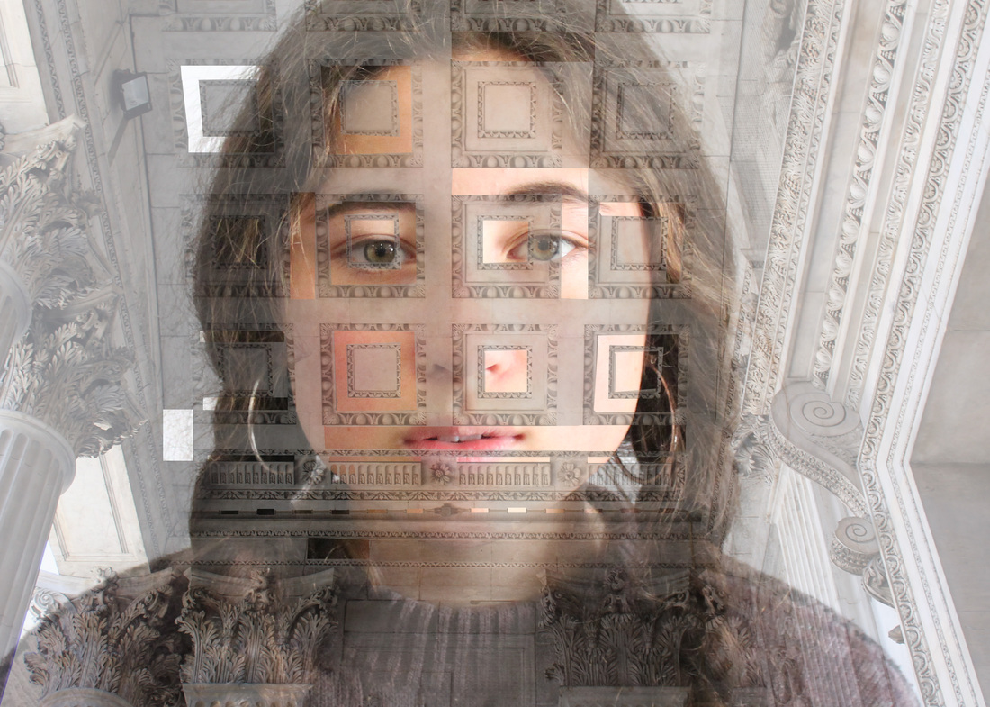
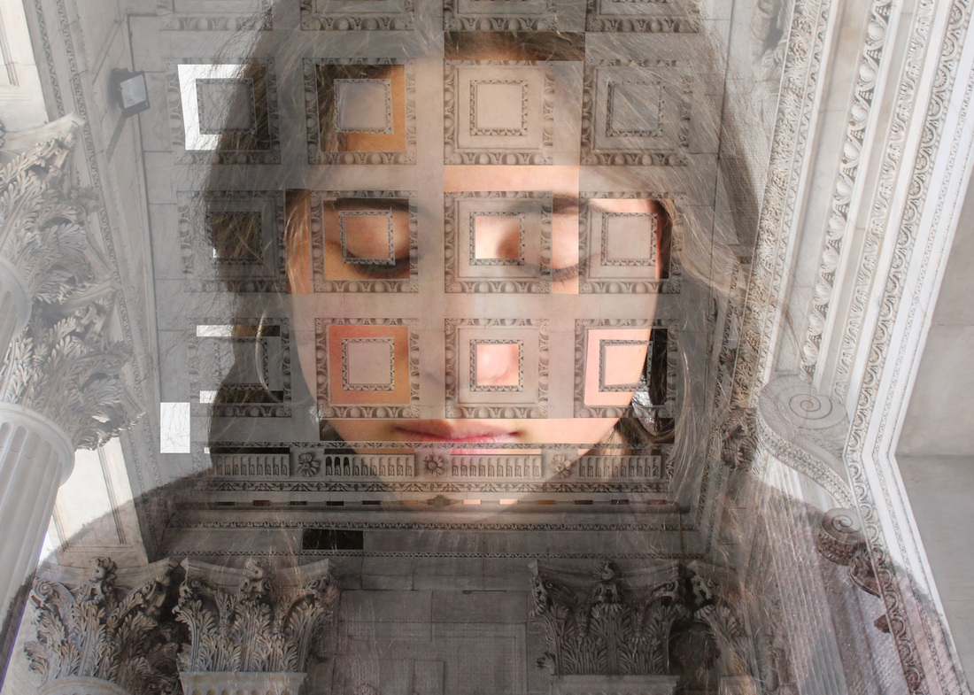
DEVELOPMENT 3: I combined elements of the natural and 'man made' worlds (a portrait and a man made structure) in order to bring opposing ideas and situations 'together'. These newest observations are of St Paul's Cathedral.
Here are the final edits for my third development. I decided to layer the building over her face but make it translucent, rather than just cutting out shapes to make the contrast obvious, while some parts of her face are more prominent.
|
|
NEW DEVELOPMENT: SIBLINGS
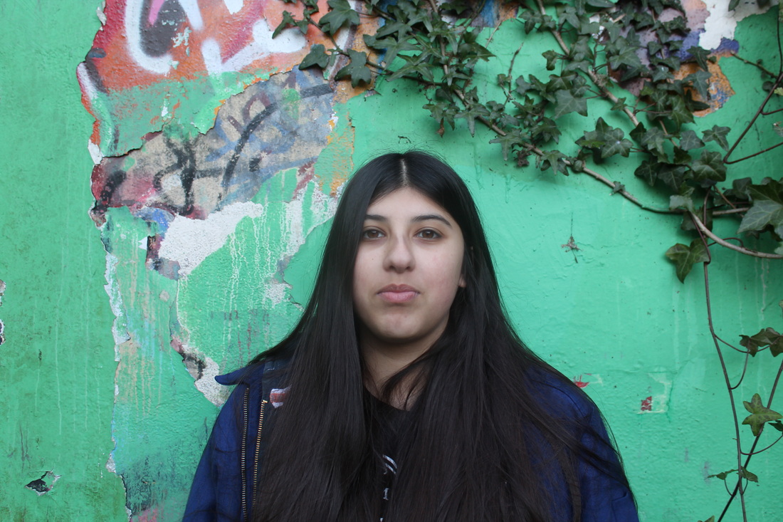
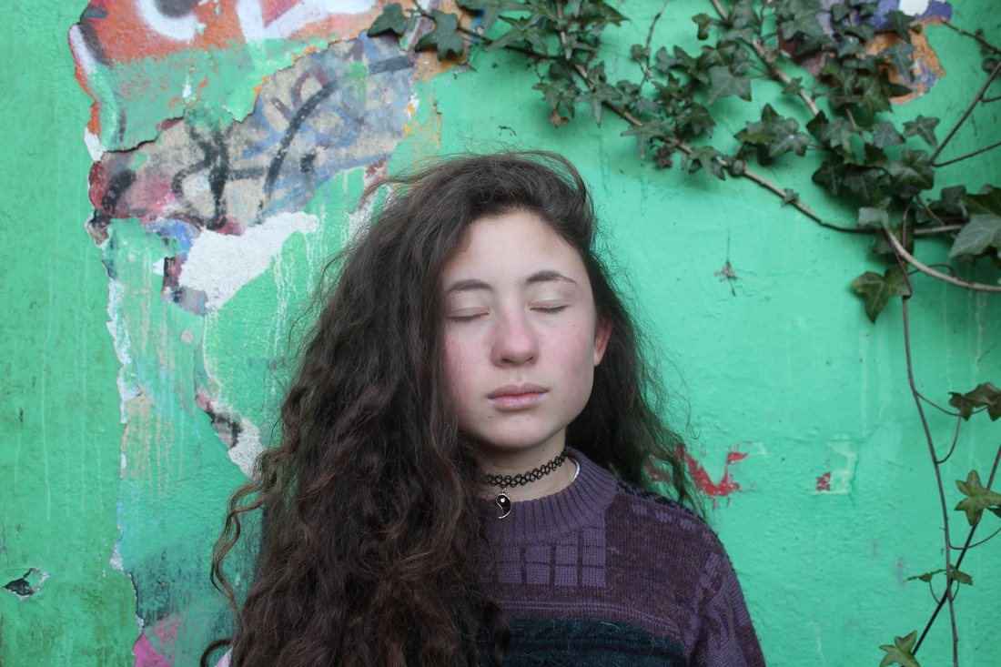
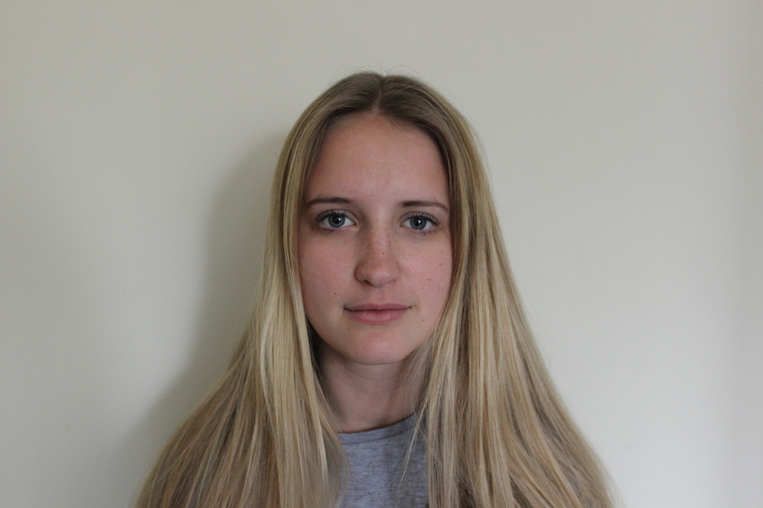
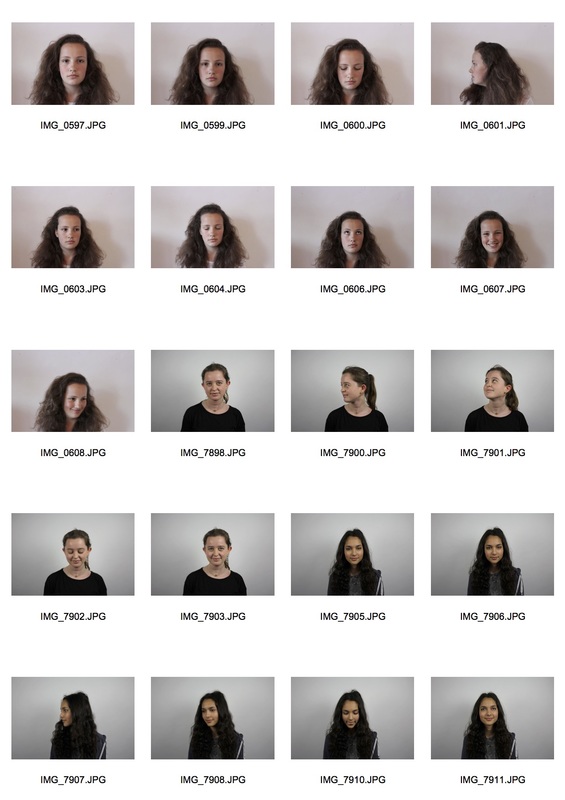
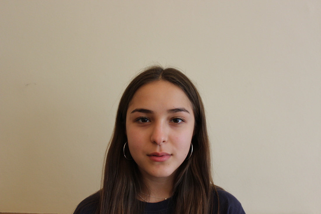
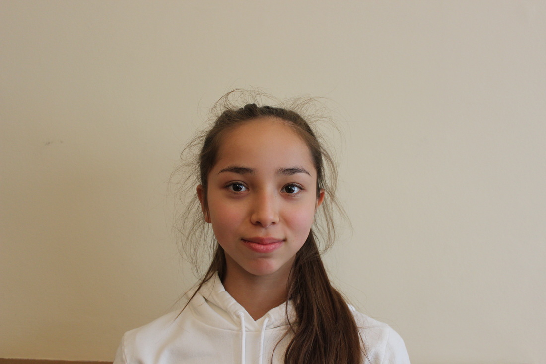
For my most recent set of observations, I photographed some of my friends with their siblings, I asked that they wore no makeup so as not to obscure any similarities they may have that would show when I edited them together. I think its interesting bringing siblings together instead of twins to highlight similar features that may not have been noticed. The lighting is different for each pair because although I took all the pictures in front of a white wall, they were taken at each pairs' house so the lighting changed between observations
Siblings contact sheet
|
TILLY (15)

LYS (18)

ESTHER (16)
MIRANDA (14)

|
|
TAMIA (16)

TEHYA (13)

|
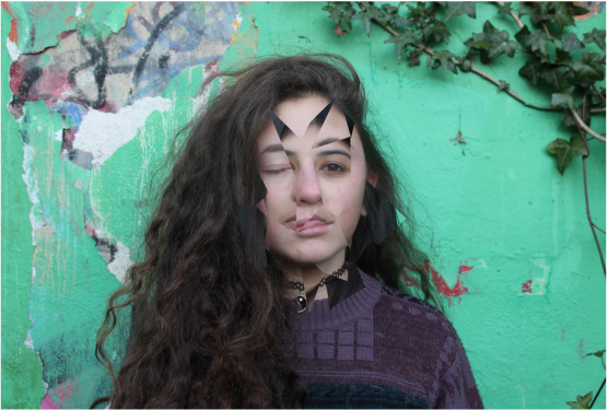
Using Bridget Riley's Light Between (1982) I edited pairs of siblings' faces together, leaving small gaps between each cut out in order to create the image of one fragmented face, i.e bringing two faces together to make one. I lined up their eyes nose and mouth to the best of my ability to further demonstrate the idea of making one person from two others.
Ivan is a graphic artist from Portugal who experiments with abstract art, print design and patterns as well as creating graphics for adverts and companies.

Shapes II
|

Friend to The Unknown
|

|
|
ESTHER (16)
MIRANDA (14)
|
Using Shapes II I cut out specific parts of the pattern in Esther's face to reveal Miranda's below, I lined up their facial features so the only major difference is the tone of their skin which adds a further illusion of it being the same person.
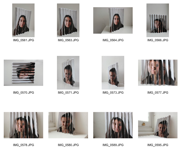
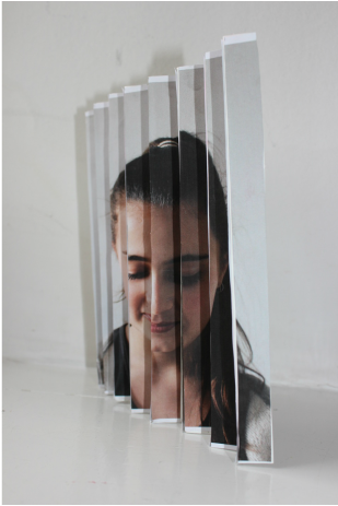
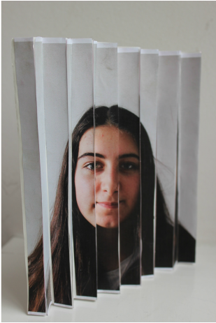
Lenticular
Lenticulars are two or more printed images with the ability to change or move as the image is viewed from different angles.
I made these in order to bring two images 'together' in a 3D format while viewed from one side or the other. However, when looked at front on the viewer sees that the images are in fact separateed. This illusion perfectly demonstrates the theme 'together and/or apart' through an illusion of depth.
I made these in order to bring two images 'together' in a 3D format while viewed from one side or the other. However, when looked at front on the viewer sees that the images are in fact separateed. This illusion perfectly demonstrates the theme 'together and/or apart' through an illusion of depth.
|
|


|
These could be improved by:
- More accurately lining up each picture to show the reality of each picture and make sure each of their facial features fits together when viewed from each side
- Making the intervals (size of each fold) smaller so that the viewer doesn't have to look at each side at such an extreme angle to view the full picture.
- Cutting and measuring the size of each fold more precisely so there are no white gaps which break the image apart.
(the original images)
|
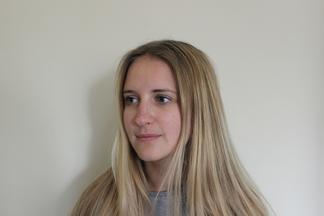
MILLIE (16)

|
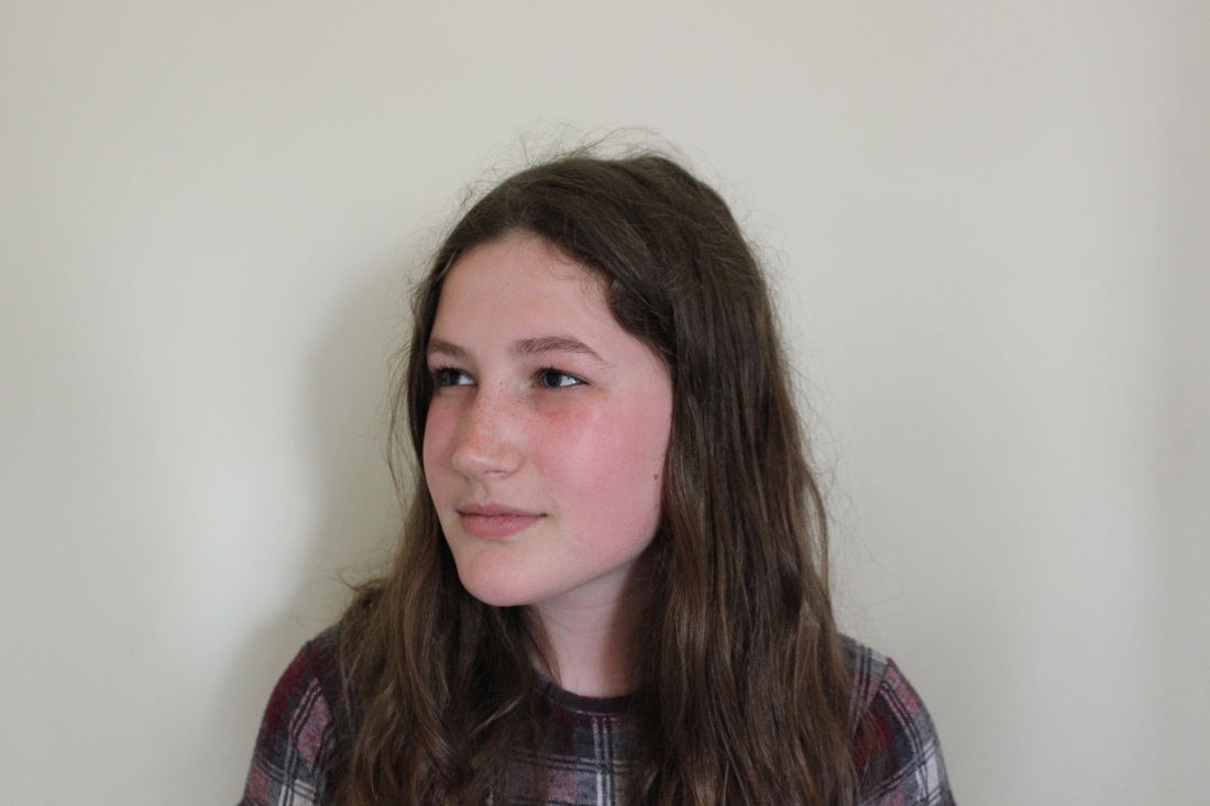
GEORGIA (12)

|
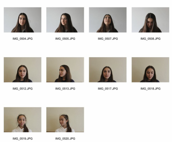
Further portrait observations
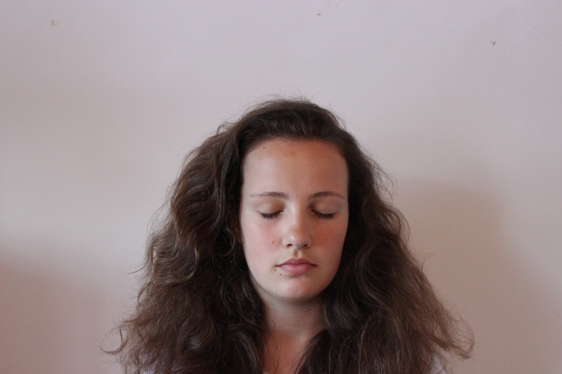
I took more observations of different people to edit. For the first half I took them at home against a white background with natural light, these could have been improved by taking them in the studio (like I did with the second half) to remove the shadows and make the images less flat.
Los Angeles based artist Gordon Magnin creates collages using black and white portraits, Magnin attempts to challenge the “intended objective, interpretation, and significance” of celebrity, advertising, and consumer based images that we are exposed to on a daily basis. He finds images, originally intended to direct and control public perception and self image, and alters them to create a sense of ambiguity and to heighten mystery behind them and their intentions.

|

|
Observations Edited
Pattern by Danny Ivan
KATE and ALEX (16 and 15)

|
|
KATE and ALICIA (16)
|
|
Further Edits
|
This is the pattern I used by Danny Ivan and how I layered it over my original images and cut out specific parts of the pattern in Photoshop. It was a complicated process because the pattern was so intricate but I'm pleased with the results as they show the similar features in each sibling put 'together' while their faces don't always evenly match up and in some places the difference isn't always too vivid.
|
|
|
I moved the bottom layer slightly in the different pictures
(ORIGINAL IMAGES) Tamia and Tehya, aged 16 and 13
|
|
CONCLUSION
Throughout this project I explored many different routes until I achieved my final pieces. I particularly liked the primary images of objects against vibrant backgrounds but felt that these demonstrated the theme of 'together and/or apart' too literally. I also liked the Lenticular as it put two people together physically, however I moved on from this because it's a very simple display of the theme. I think my final images are successful in showing the theme in ways which have already been explored (such as the fact that similar features of people, which may have been disregarded before, are brought together). I think these could have been improved by altering the lighting and/or adding more people to create more depth in the images, however this may have become too complicated and confused the viewer.
